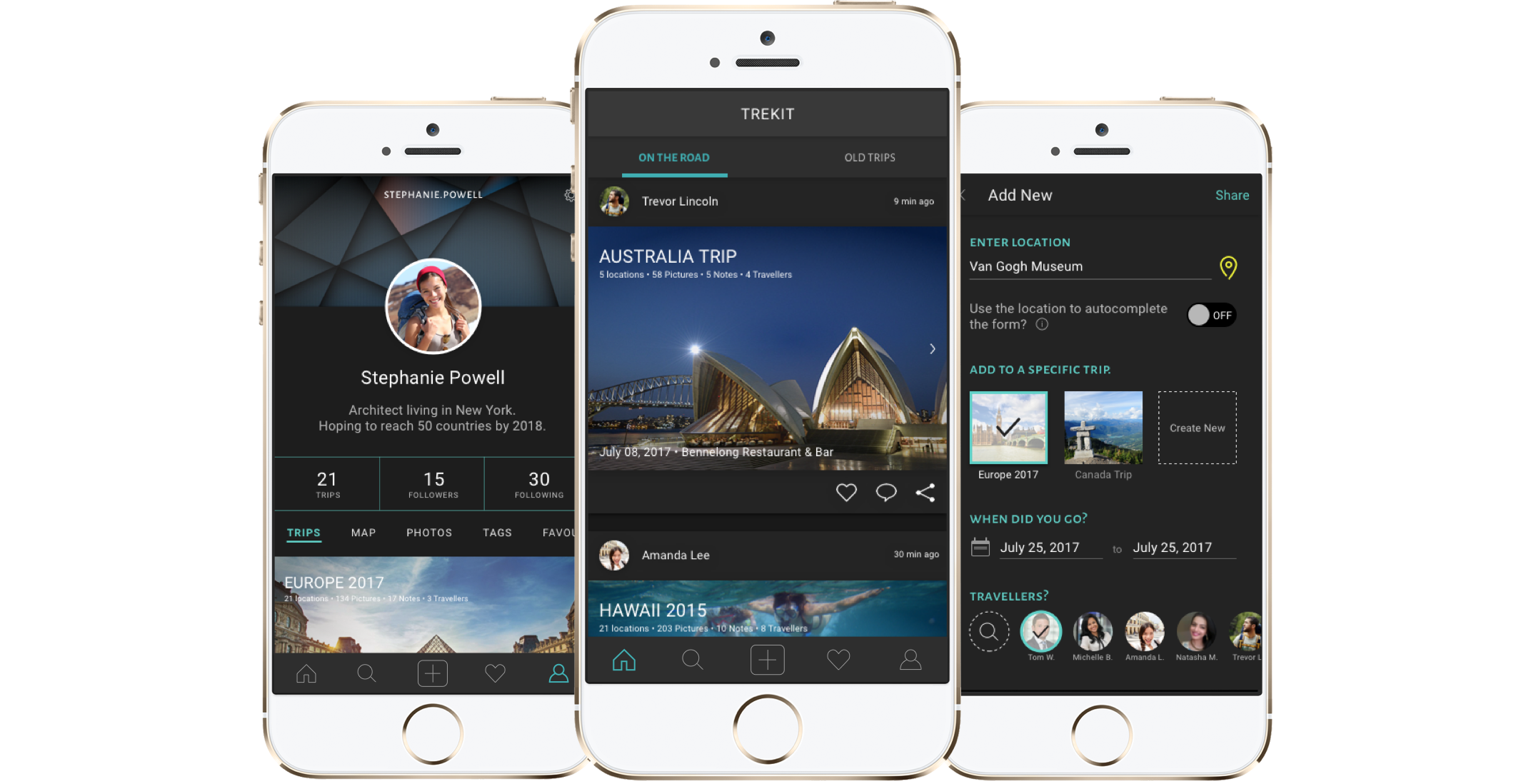
Trekit
With a focus in travel documentation, I discovered through empathy research that a large portion of travellers have trouble remembering their trips.
So, I designed a travel sharing and collection application that brings the journey right into the users’ hands.
Role / UX & UI
Process / Research, Strategy, Design, Testing
How might I help travellers remember their trips?
What do users like to share?
I asked users to share their 2 week vacation with me.
Through my interviews, I’ve discovered that travellers share the most of the following: locations, activities, pictures, duration of the trip, and who they went with. And sometimes, they’d provide some recommendations from their experience.
However, I discovered that many of them had trouble remembering what they did on the trip. When asked for specifics, many of them resorted to social media, Google photos, and even emails to search for details.
“We went to so many places that I don’t even remember what we did.”
“I went to this restaurant that was close to my hotel, but I don’t remember what it was called.” (checks Google Maps)
“Check out the places I went to.” (shows Instagram)
Exploring Ideas
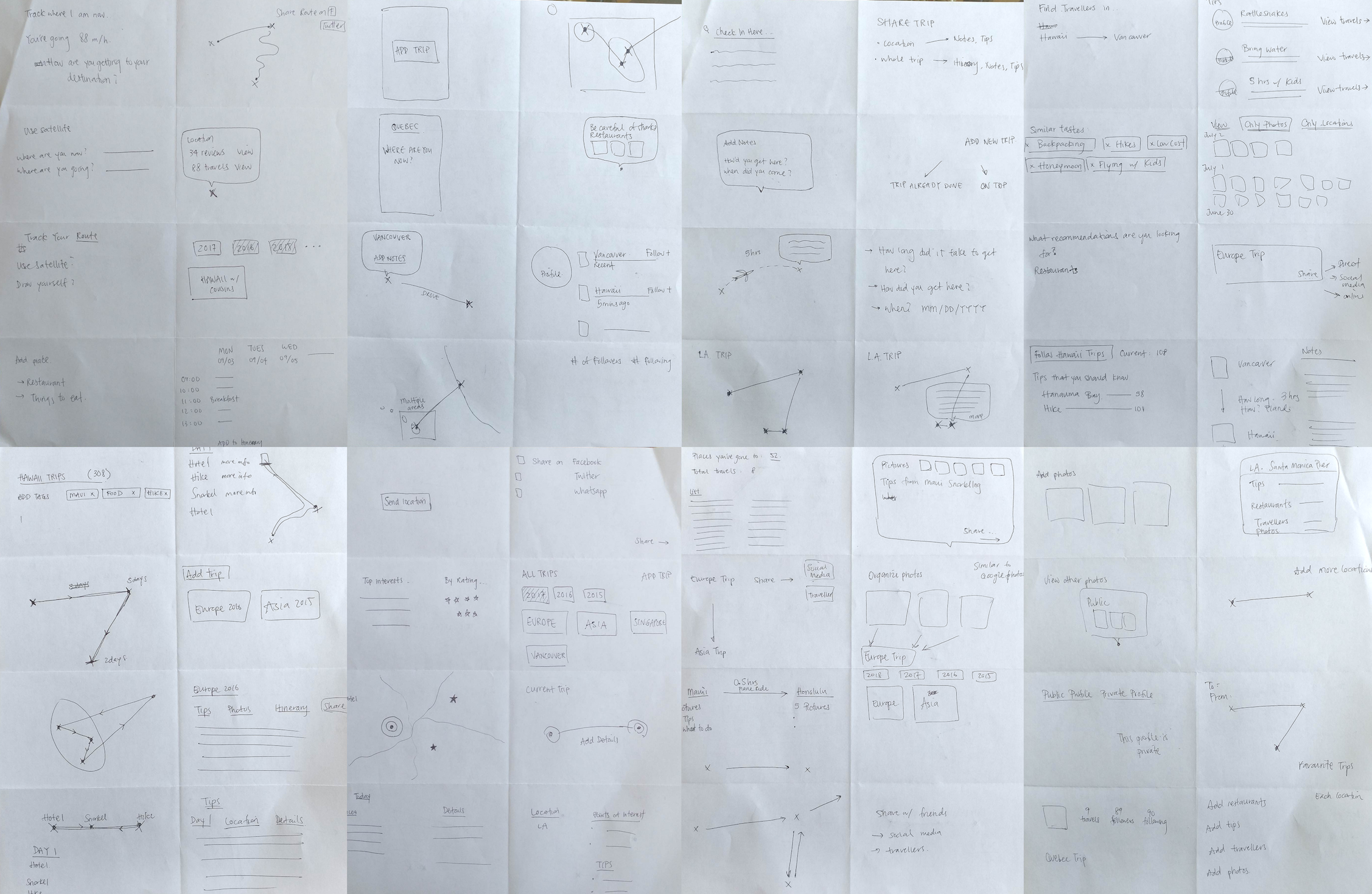
Fifteen “How Might We” statements were carefully thought out to capture all the problems that arise when the traveller wants to share their trip.
How Might I (We)...
...help travellers recall their trip years from now?
...allow travellers to share their favourite memories with other travellers?
After brainstorming many ideas using the Crazy Eights exercise, I’ve decided to create a mobile app. The reason for this was to allow on-the-go travellers to quickly update their friends and family through their pocket device.
Solution: On-the-go documentation
In order for travellers to remember what they did, they would need to document their travels as they travel.
Mid-Fidelity Wireframes
I conducted multiple usability tests to receive user feedback on the wireframes. The tests were conducted on Marvel in person with three users.
“What’s the difference between Destination and Location?”
“I can barely see the images and text [on the homescreen].”
“Where is the share button?”
Problem: Different terms, same meaning
During the user tests, a number of users were confused by the usage of similar terms in different areas I was using on the wireframes. This included: trip, location, destination and journey.
I clarified the two terms, Trip and Location, through a visual representation and a sitemap.
Brand Style Guide
The brand was created for Trekit is one that represents excitement, curiosity, individuality, and adventure.
High Fidelity Wireframes: Iterations
I’ve created numerous iterations based on user feedback and to achieve the dark theme wireframes on the right. I have chosen to focus on the dark theme due to its powerful impact on photos, popping right at the user.
Final Wireframes
“Can I not edit the post on the homescreen?”
“How come the date was selected for me?”
“Is there a way to search for the traveller rather than scroll infinitely?”
After the high-fidelity prototyping, I was able to translate the users’ questions into problems, which allowed me to make necessary adjustments to my high-fidelity wireframes for a better user experience.
Reflection
This passion project was built out of pure curiosity and my love to travel. It was daunting at first, as there are currently no applications that focuses on sharing travel memories. However, at each step of the way, this project continued to excite me as I continuously encountered multiple design problems.
Looking back at the project, I’ve realized the importance of user testing. They tell us something that us, designers, cannot think or see. Ultimately, I’ve learnt to open both my eyes and ears to absorb what users really need and provide them with the best option.
Continuing on, I would translate the mobile version into a desktop version, as it is beneficial for those who edit their travel photos on their desktop devices.
Happy travelling!


